Visual Identity
BRIEF
The creation of the visual identity for the hotel Castello S. Antonio, keeping the existing logo.
IDEA
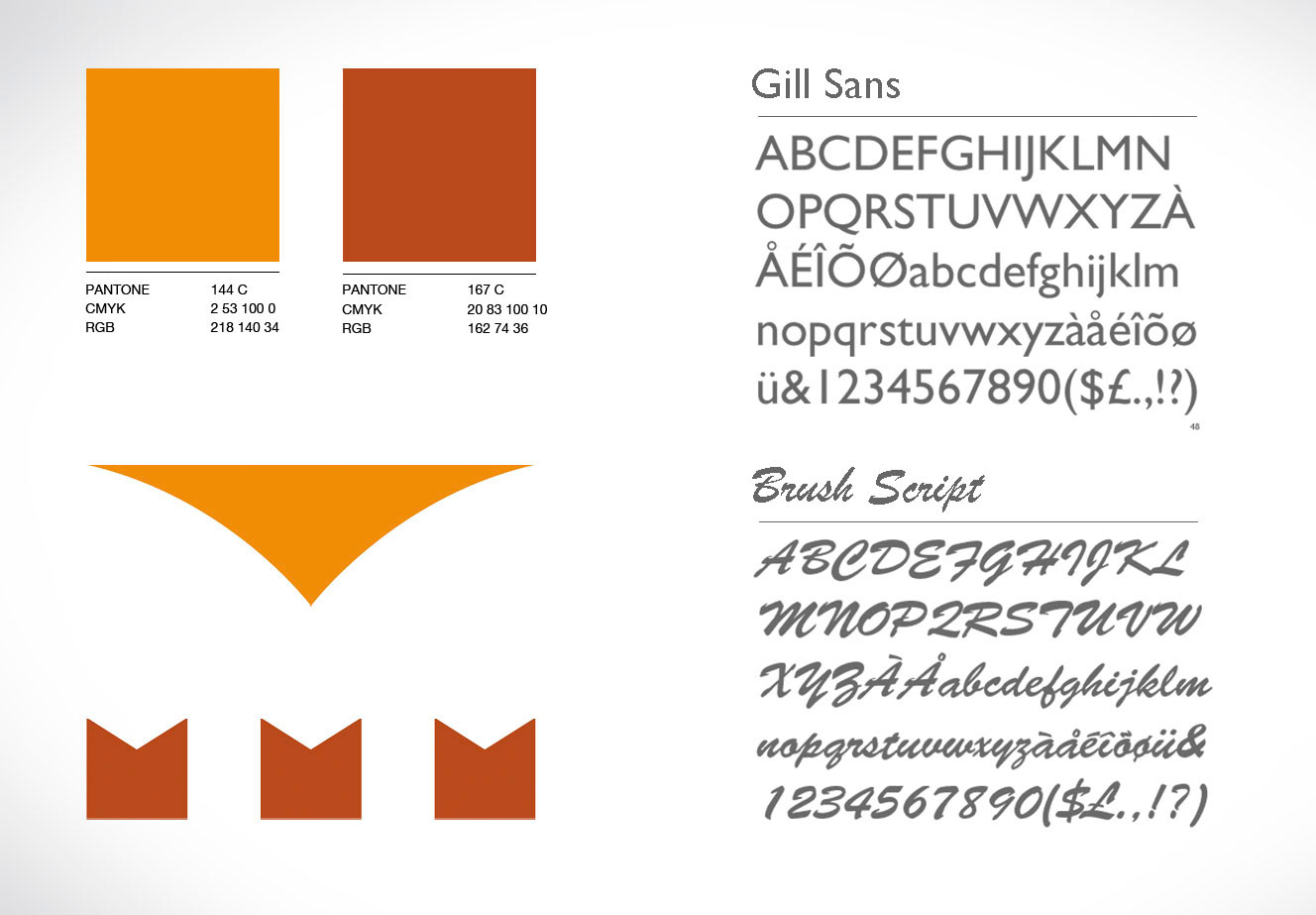
My idea was to use the towers as elements for the visual identity, to put the attention on the concept of Castle, to give the idea of a comfortable and luxurious location. I picked yellow an dark red as main coulors, to create a sensation of warmth, elegance, and welcoming. Moreover, the triangle on the top creates the shape of an open book, to represent the idea of relaxation, holidays, and chilling time.
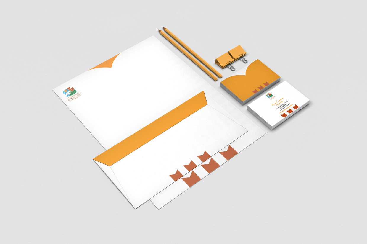
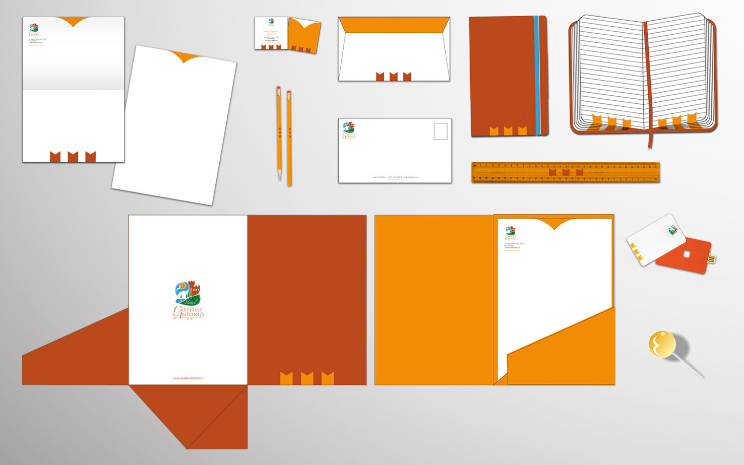
Stationery and merchandising

Experiential design - Stand
The client required the creation of a stand to mark the presence at conventions and events, my idea was to show the atmosphere that costumers could find at Hotel S. Antonio Castle. A green point, as a garden, to grab the attention of the people, the entrance is a big yellow circle as the sun in the logo, trees that hold the structure of the roof, covered by grass as well, and another tree as a display for the informative material. Moreover, I though about a chilling - area, with armchairs. These are massage armchairs, where anyone can relax and enjoy the area, as well as it would be possible at the Hotel S.Antonio Castle.